Ritu Bhangale

loading in Monsoon ऋतु

Skip to main content
← Back

ETMoney explore 0 - 1
  • RoleLed IA exploration, owned Explore end-to-end
  • Timeline1.5 months design, 3 months tech
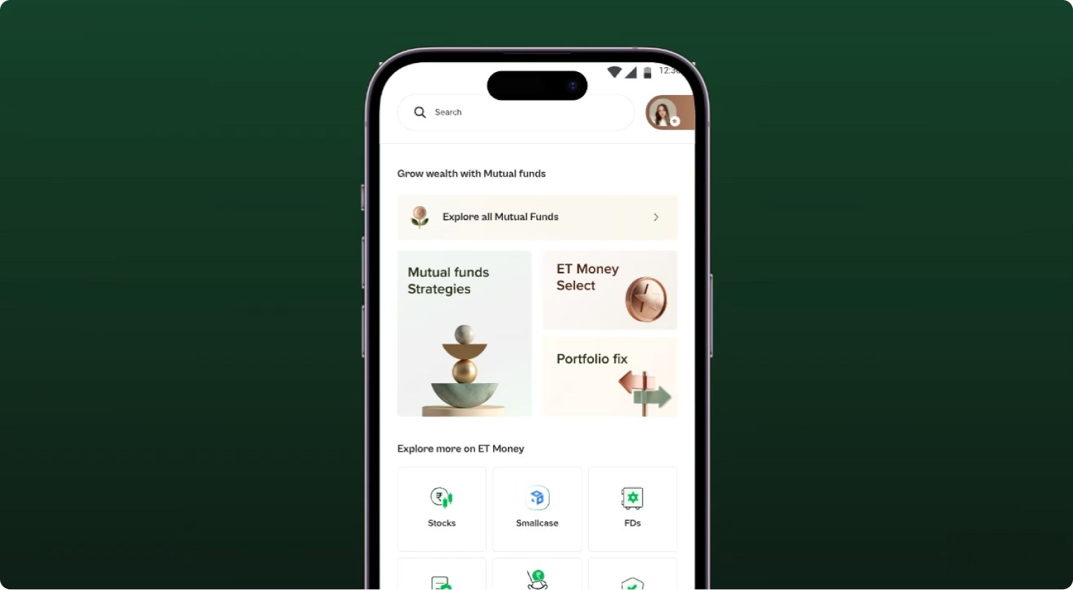
The redesigned ET Money home screen on a phone, over a dark green cover

Why Redesign?

Evolving business goals led to a shift in how users perceived ET Money. Our app store & Play store reviews started reflecting the same.

The existing app structure didn’t support the goal of ET Money to be a wealth powerhouse.
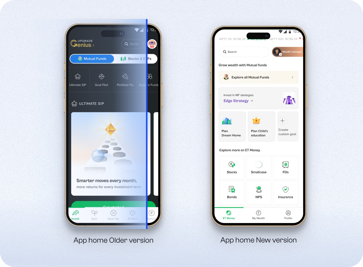
The ET Money app home screen, older version beside the new version

Rebuilt the IA

One unified Explore now holds every product, with Mutual Funds kept as the anchor since it is still ET Money's core business. Tracking moved into a single consolidated dashboard, so discovery and tracking stopped competing for the same space.
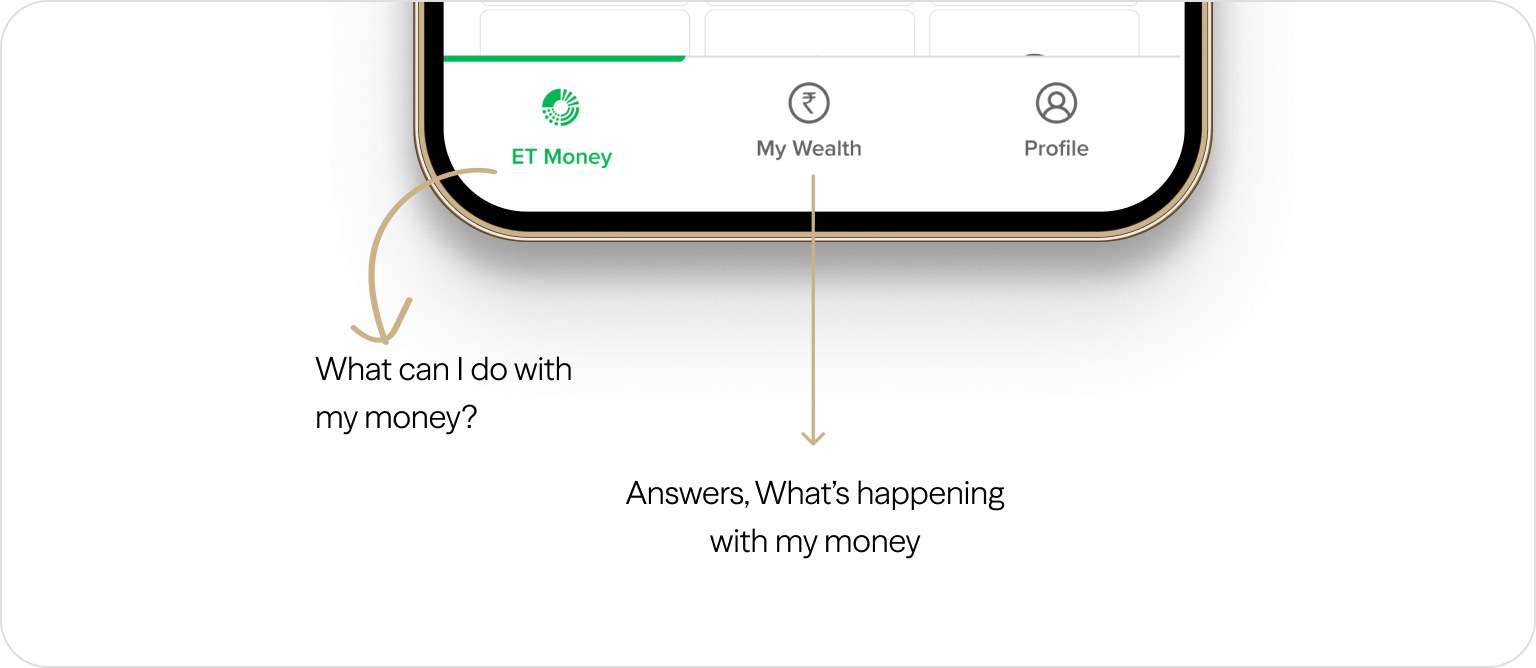
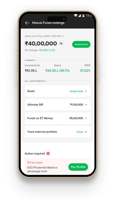
The redesigned bottom navigation, where the ET Money tab answers what can I do with my money and the My Wealth tab answers what is happening with my money

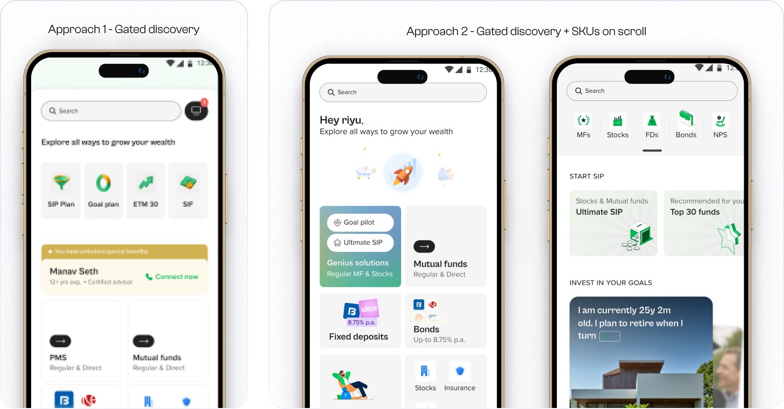
Different approaches & iterations

Approach 1, gated discovery, beside approach 2, gated discovery with product SKUs revealed on scroll
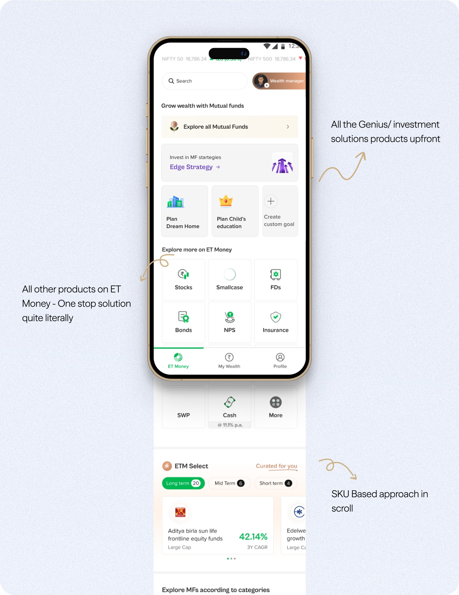
The shipped Explore screen scrolled top to bottom, with Genius and investment solutions upfront, every other ET Money product below them, and SKU based cards further down the scroll

Impact

+73App-store NPS, up from −10
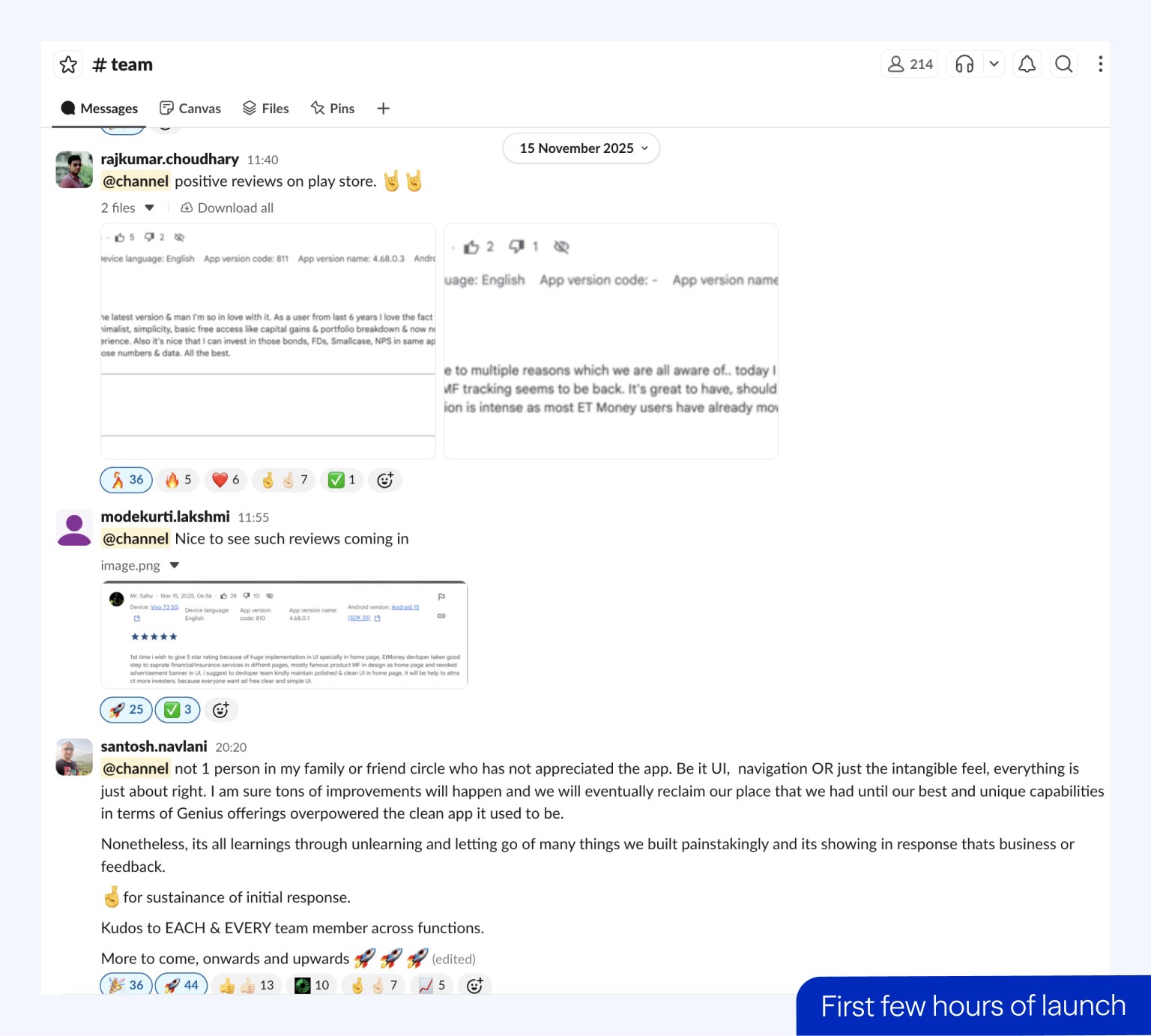
A team Slack channel filling with positive Play Store reviews in the first few hours of launch
~15%Product discoverability, up from 4.32%
1.64Average products held, up from 1.2

Read full case study
Next case study

Mutual funds dashboard

Read