← Back
Mutual funds dashboard
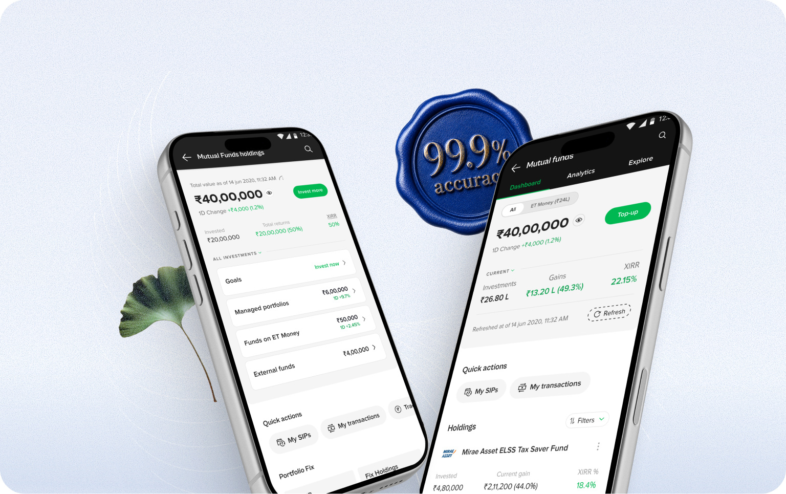
This design started as part of a major restructuring of the app.
Instead of cosmetic changes, I decided to understand the problems users faced and solve them. I started by identifying UX friction points in the current dashboard.
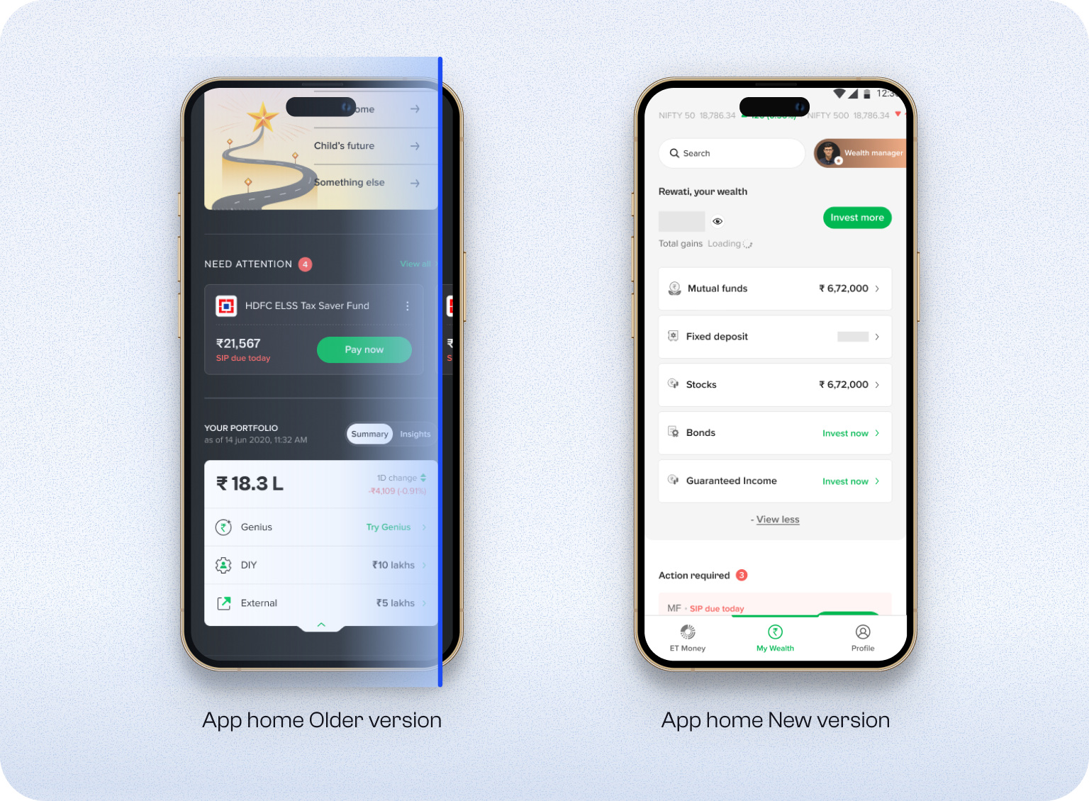
Data analytics, support tickets, and user interviews uncovered something unexpected.
UX issues: buried workflows, no unified view, and portfolio performance that was difficult to understand.
Unexpected: a data problem, where 2 to 3% of users saw the wrong values.
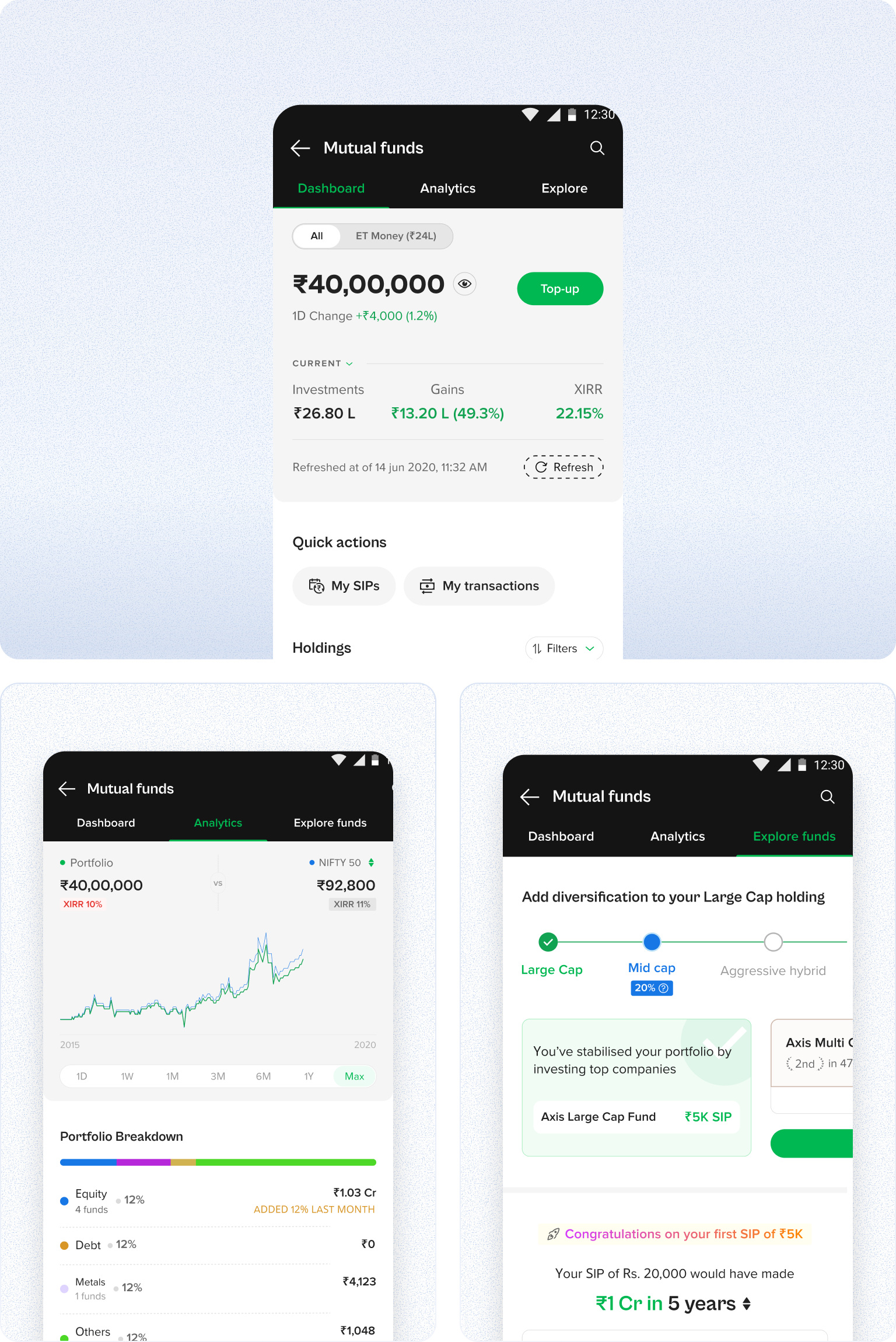
Built the dashboard by solving for the UX issues, making the portfolio snapshot easy to understand and consume.
Considering engineering effort versus impact, I decided to ship in phases, starting with the UX issues. We were solving for two different users: Genius and DIY. For the portfolio snapshot, Genius investors cared most about total returns. For DIY investors, current returns mattered most.
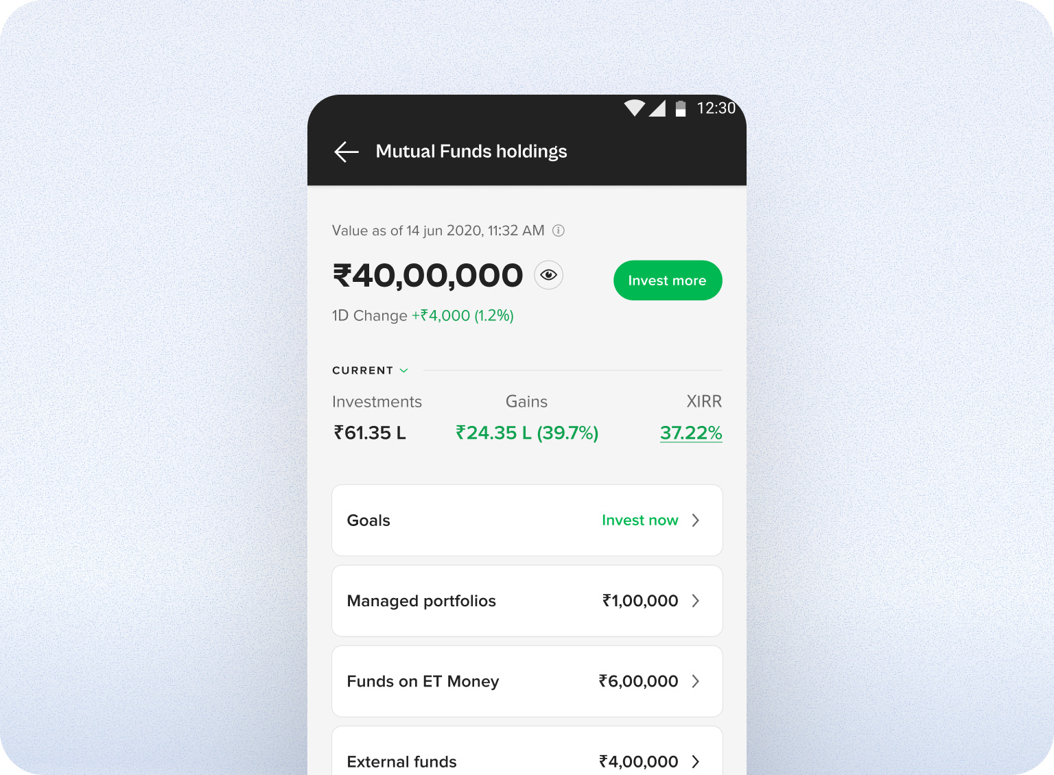
In Phase 2, after understanding the backend deeply, we decided to skip preprocessing entirely.
Phase 1 showed us that users skipped segmentation and wanted to see insights directly. Every fetch from MF Central arrives correct, but a reconciliation engine then matched those transactions to holdings using folio numbers, and for a slice of users it guessed wrong. Phase 2 reads holdings directly from MF Central instead, bypassing that layer. This compromised the segmentation of external and internal funds, so of the two approaches considered, tags at the fund level or a toggle, we shipped the toggle as an All versus ET Money split.
- 99.9%Portfolio accuracy
- −14.32%Support tickets
- 2Rollouts shipped

Next case study
Read